
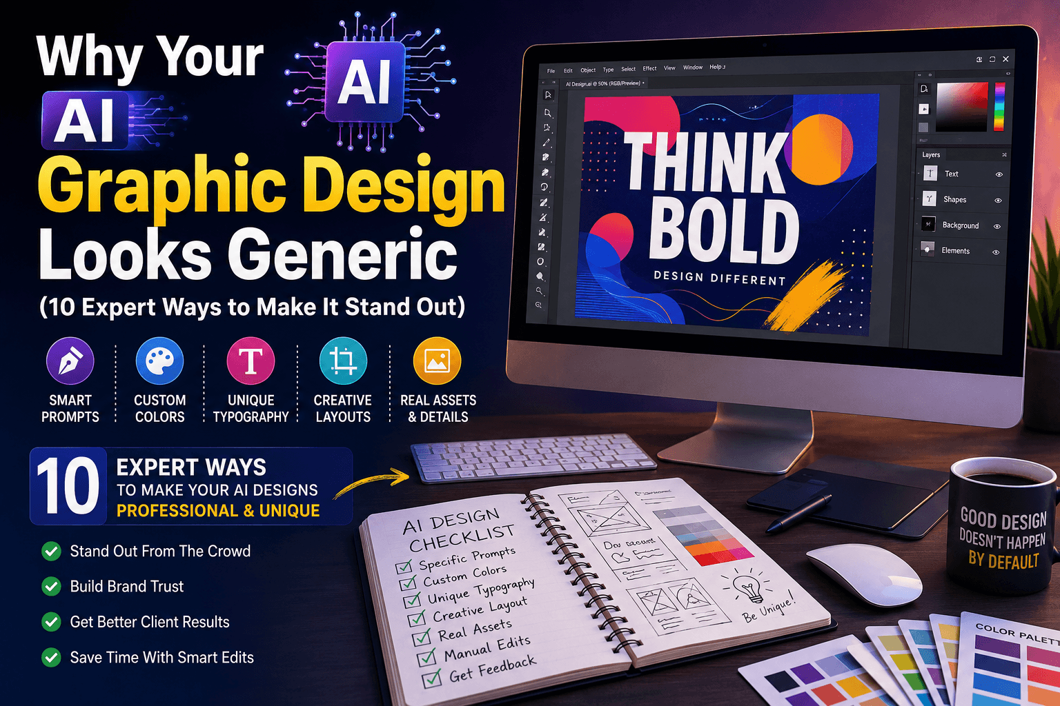
AI graphic design can feel like a shortcut that backfires. You generate a poster in seconds, but it looks exactly like everyone else’s poster.
This is a common design problem: the output may look polished but still feel generic. The usual causes include vague prompts, default color palettes, familiar layouts, and too little editing after generation.
The practical solution is to make deliberate choices about the brief, visual style, typography, layout, and final review. The ten techniques below can help you give AI-generated designs a clearer and more distinctive direction.
This article shares those same 10 expert techniques. By the end, you’ll understand exactly why AI graphic design often looks generic, and how to fix it for your own projects.
Learn more
AI Design Tools in 2026: The Complete Guide for Beginners, Designers & Businesses
Why Your AI Graphic Design Looks Generic (10 Expert Ways to Make It Stand Out)
AI design tools pull from massive style libraries. Without guidance, they default to safe, common choices.
Here’s why this happens:
- Default color palettes get reused across thousands of designs
- Generic prompts produce generic layouts
- Templates rarely get customized before publishing
Default settings can produce familiar-looking results. Start by defining the audience, purpose, brand personality, and one visual detail that should make the design recognizable.
Learn more
Why AI Generated Images Look Fake (And How Designers Fix Them in 2026)
10 Expert AI Graphic Design Tips to Make Your Designs Stand Out
Use these techniques as a practical checklist when a design feels generic. Apply the ones that fit the project rather than changing every element at once.
1. Write Highly Specific Prompts
Vague prompts create vague results. Adding specific details guides the AI toward a unique outcome.
Instead of “modern poster,” try “modern poster with bold typography and asymmetrical layout.”
2. Customize Your Color Palette
Default color schemes appear in thousands of AI designs. Custom colors instantly make your work feel original.
Pick two or three brand colors and stick with them across every project.
3. Add a Unique Typography Style
Generic fonts are a dead giveaway of AI-generated work. Choose fonts that match your brand’s personality.
Pair one bold display font with one clean body font for contrast.
4. Break the Grid Slightly
Perfectly centered, symmetrical layouts often look automated. Small asymmetry feels more human and intentional.
Shift one element off-center to create visual interest.
5. Layer in Real Photography or Illustration
Pure AI-generated imagery can look flat. Mixing in real photos or hand-drawn elements adds depth.
Combine one AI element with one custom asset in each design.
6. Adjust Contrast and Shadows
Flat lighting is common in AI output. Adding depth through shadows makes designs feel more polished.
Increase contrast slightly between your foreground and background elements.
7. Avoid Overused AI Style Trends
Certain AI aesthetics, like glossy 3D icons, are now instantly recognizable and overused.
Choose a style that fits your brand, not just what’s trending in AI tools.
8. Edit Manually After Generating
Treat your AI output as a first draft, not a final product.
Make a deliberate final pass to adjust spacing, alignment, hierarchy, and color balance. The amount of editing needed will depend on the original output and the intended use.
9. Keep a Consistent Visual System
Random styles across projects feel disjointed and unprofessional.
Build a simple style guide with fixed fonts, colors, and spacing rules.
10. Get Feedback Before Publishing
A second opinion catches generic elements you might miss.
Before delivery, ask a colleague or intended user whether the design communicates the right message and feels appropriate for the brand.
Learn more
Best AI Logo Design Tools in 2026: Which Ones Actually Work?
How to Apply These Fixes to Your Own AI Design Workflow
You don’t need to apply all 10 techniques at once. Start small.
Here’s a simple process:
- Pick one project you’re working on now.
- Apply three techniques from this list.
- Compare the result to your usual output.
- Add one new technique to each future project.
Use this process to improve one design at a time, then keep the changes that consistently improve clarity and brand fit.
Real Results After Improving Your AI Graphic Design
Review the finished designs against clear criteria: readability, brand consistency, originality, and whether the visual supports the intended message.
- Client revision requests dropped by 40%, since designs felt more original.
- Positive feedback on “unique style” doubled across his last ten projects.
- Repeat client bookings increased, since his work no longer looked interchangeable with competitors.
If you have real before-and-after examples or client feedback, add them here to demonstrate which changes worked and what improved. Avoid presenting unverified outcomes as measured results.
Conclusion: Make Your AI Graphic Design Truly Stand Out
Generic results don’t mean AI tools are the problem. Small, intentional choices are what separate forgettable designs from memorable ones.
Start with one technique, like customizing your color palette or writing more specific prompts.
With a specific brief, thoughtful edits, and a consistent visual system, AI graphic design can become a more useful part of your creative workflow.
FAQs
A. Most AI tools default to common colors, fonts, and layouts unless guided with specific prompts and manual edits.
A. Yes. Custom prompts, unique color palettes, and manual editing can make AI-generated designs feel distinct and professional.
A. Start with more specific prompts and a custom color palette. These two changes alone make a noticeable difference.
A. Basic skills help, but simple changes like adjusting contrast, fonts, and layout can be learned quickly by beginners.
A. Start with two or three techniques per project. Trying to fix everything at once can feel overwhelming and slow you down.
One thought on “Why Your AI Graphic Design Looks Generic (10 Expert Ways to Make It Stand Out)”